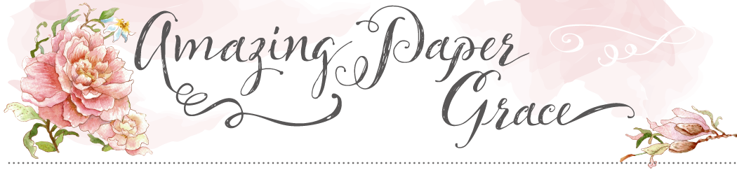
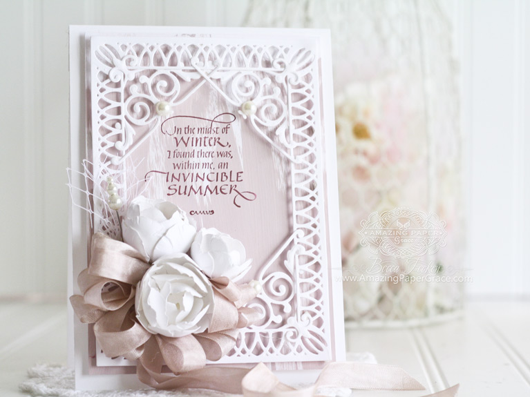

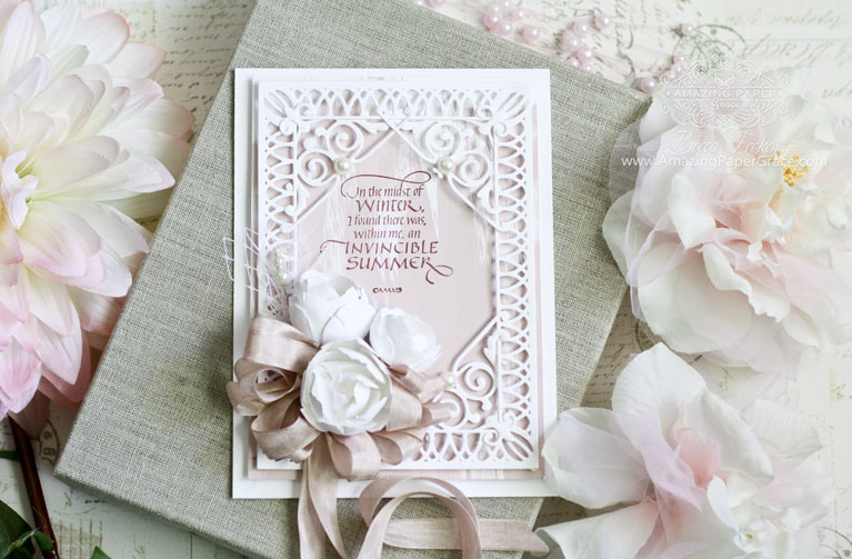
Surprise! I’m back again today friends and I hope you are having a glorious summer! Speaking of summer (although figuratively) today I’m using a new quote stamp from QQuietfire Design that I haven’t used before – In the Midst of Winter. It was my mission today, not to use gold, lol. As a shopper, I’m perpetually on the hunt for the “right shade of pink” and last week in the craft store I randomly bought a bottle of chalk paint because it was precisely “the right shade of pink”. At the time I knew that I’d be painting it onto paper; I swoon over the texture of chalk. So there you have it, that was the inspiration for today’s card – an ode to pink.
Walk Through on How to Make the Card
Base
The base of the card is 5-1/2″ x 7-1/2″ on white Neenah cardstock. I used the same white paper cut to 5″ x 7″ and painted chalk paint down the front with a foam brush that I had blotted most of the paint off of. It dried in less than 5 minutes. (By the way, I used the Hinged technique to make the large card base).
Focal Panel
I used Spellbinders Labels 52 Decorative Accents along with corner elements from Spellbinders Imperial Square. The lines on the die are fairly narrow so the best way to adhere the frame to the base was by using thin slivers of double stacked foam tape. Both the painted layer and frame are elevated this way.
Embellishment
I reached out for easy Spoon Flowers using Spellbinders (Contour Die) Layered Blooms. Using just the two smallest petals I created two spoon flowers using three medium petal sets and two small petal sets. Then I created a smaller bud using three small petal sets. They were glued onto a Seam Binding bow and embellished with net and a corsage pin. I finished up with four large pearls in each corner – 1 is hidden.
About Day of Giving Friday
Every Friday it’s my pleasure to give away a card. The card goes to a randomly picked reader (worldwide) who leaves a comment in our conversation. Want to know more about Day of Giving, here’s a link to my FAQ’s just check out #11. For your comment today: What’s your favorite color and why?

Rubber Stamps: Quietfire Design – In the Midst of Winter
Craft Paper: Neenah Classic Crest – Solar White – 80lb Cardstock, The Fine Touch Gold Metallic Poster Board – Hobby Lobby
Ink: Fresh Ink – Merlot
Accessories: Spellbinders Labels 52 Decorative Accents, Spellbinders Imperial Square, Spellbinders (Contour Die) – Layered Blooms, Hug Snug Seam Binding – Rose Beige, Recollections Pearls, Corsage PinJust a note to say don’t worry if you don’t do Instagram :-) It’s all good! I have several new friends over there and I love it that I never miss a comment over there – I get alerts and it alerts folks that I’ve responded back. That said, I encourage you to live fully within your comfort zone with no apologies. Have a great weekend friends – you’ll likely see another card from me because I’ve cleared up my desk to create!!


Such a stunning card Becca. Love that quote! I hope to have an invincible summer. My mom passed away last month and I had a miscarriage in March so the first half of the year has not been good. Hopefully Summer will be good to me and the rest of the year will be better. :)
My favorite color…pink! Just love it! So shabby chic and pretty.
As always…your work always impresses me. Hope all is well with you and your family.
Hugs…
Melissa
Oh no Melissa, I noticed you were missing from the Instagram community. Sweet girl I hope all is well with you and I’m putting you down on my prayer list right now. Be well my friend and know there are many who sincerely care about you!
Many prayers in this season of grief…so hard. Blessings to you and yours.
I am so very sorry for your losases hun {{{hugz}}}. Am praying for you.
I’m SO sorry, Melissa!!! Praying for you right now. Sending my warmest wishes and my hopes that God will bring you comfort you can feel and give you encouragement that only He can bring…
Hugs,
Joanne
Melissa thinking of you so sorry for your loss take care of yourself
Hugs PamX
May you be surrounded with pink light – the protective light of angels! Prayers and blessings wing their way to you.
Oh, Melissa, so sorry for your troubles earlier this year. I do hope those bad times are behind you now and you will have much joy in the days ahead.
i am so sorry for the loss of your mom and sweet baby praying for you and your family….
All things purple!!
That’s a cool background! Never thought of something that simple!
Another stunning and fabulous card here Becca. I just LOVE your white cards with just a tiny splash on color to them, and as always the sentiment is sooo awesome too.
My favorit color or colors are all blue/green shades, and don´t ask me why cause I simply don´t know, I just know, that I´ve always loved these shades and seems to use them a lot in everything I do, except from, when I think about it and by purpose choose something else he he he.
Have a wonderful week-end now everyone and lots of crafty fun too.
Another gorgeous card, especially the sentiment and the flowers. Love the pop of pink behind everything. My favorite color is blue because it’s the color of the sky and the ocean, and always has a calming effect for me. Have a great weekend!
Hi Becca, beautiful card, I don’t know why but I love the blues.
Enjoy the Summer and take care.
Rene from OZ xx
Love the pink! Very pale and subtle but still there! Thanks for sharing!
another great card Becca I would say I love silver and white or pastel colors. Christine S.
Blues are my favorite color they seem to be so tranquil and easily decorated and besides it is my moms favorite color
Cleared your desk? Egads, I need to do that too. And then I need to separate my big scraps and recycle the smaller scraps.
Beautiful card. I didn’t realize the different colors until I saw the close up.
my favorite color is blue. I don’t know why, it just is. I also love bright , in your face colors.
I love purple! Thanks for chance to have one of your creations!
OH GRACIOUS! As an “artist” I can’t just pick ONE FAVORITE COLOR! But, my favorite COLORS, are JEWEL TONES!!! OF COURSE, with GOLD! LOL WHY???? I LOVE the richness of the tones of the colors in Jewel tones!!! DEEP & FULL OF COLOR!!!Gold is my favorite metal tone!!! GOTTA HAVE SOME SPARKLE TOO!!! LOL ;)
I love your card,your work is always stunning. Favorite color is hard to pick as I love so many colors!
One of my favorite sayings…I created a counted cross stitch of this a few decades ago, and just love it.
Favorite color – depends on the day and mood, but I tend to move towards greens and blues…purple. Lately I’ve been loving working brights on black…yellow. Fun fun fun.
Love this card, and thanks for challenging yourself to work outside your gold comfort zone. I know how easy it is got get caught in a cycle sometimes! Can’t wait to see what you’ve cleared your desk off to create!
Joni
Love this card. Did the chalk paint warp the paper? Pink is my favorite color. It’s a color that is so calming.
Juanita, I was shocked but it did not. I have to admit that I removed most of the paint from the brush by dry brushing it on a paper towel. Because it was a good bit dry – that’s how I got the streaks!
Hi Becca
A very beautiful card , loving the design and the verse.
Hopefully Summer will be better for My Son and all our family , we have had a terrible 3 months of Hospital and tests , my lovely son was diagnosed with cancer and after major surgery and 3 weeks in intensive care was allowed home on Monday ,however he has to get his strength back and has such a long way to go ,we can only pray that all will be well after the intensive treatment.
My favorite color is coffee with cream , i think it has class and works so well together.
Take Care Becca
God Bless
Elaine H X
Sending you hugs Elaine and saying a prayer for your sweet son! The thing is home is a wonderful place to be and with the love of family I pray he makes an immediate recuperation. Take care dear.
Thank you for your kind words Becca, Andrew was admitted to Hospital again last night ,he has some sort of infection ,we hope it gets sorted soon.
Take care
God Bless
Elaine xxxx
Thank you so much , it means such a lot xxx
I am praying for your son and your family {{{hugz}}}}.
Thank you Karen
God Bless
Elaine xx
Elaine know how hard this is ! have people around me going through
the same thing it is cruel . Take care hope things go well for you all PamXXX
Thank you so much Pam god bless you and your family .xxxx
Elaine, I’m so saddened by the trials your family has experienced these past months. The love and support your son experiences from you and the family will help him in his coming fight. I so hope you will have better news in the coming weeks.
Thank you so much Chelsea , sadly Andrew was admitted to Hospital last night , he now has an infection, hopefully it will be soon be sorted out , then we can concentrate on getting him stronger .
God Bless
Elaine, praying for you and your son for a fast and strength filled recovery…
Thank you Vickie it means a lot .
God bless
Elaine xx
Elaine so sorry to hear of your sons struggles will be praying for him hope everything turns out positive of you all.
Nancyd xxx
Thank you Nancey your kind words mean such a lot
God Bless
Elaine xx
Fav color is red, don’t know why, just like it, but I have many others I like too…love the card and the spoon flowers, I really need to try to make them, the video makes it look so easy…take care and thanks for always sharing..
Anything Ido with GOLD or PINK is always good for. My really fav is soft pastel yellow – just so soothing. Yellow reminds me of the sun and that makes me happy! Have a great weekend my friend.
Hugs
Mstgane
Ann R
Oh Becca – I just love the subtlety of the white with the pale pink chalk paint. The card is a picture of elegance.
I love green but mauves and pinks follow hard on its heels. Green is so restful and I have green in many of the rooms of our home. I bring the outside in :o)
Hugs
Anne (UK) x
Another gorgeous creation. Thanks for sharing all of your God given talent with us. Have a beautiful summer.
I love a dark blue. I think that when we were going together, before we got married, my husband liked me in blue. He said it brought out the blue in my eyes. Maybe that’s why I like it so well.
Hi, Becca,
This is a beautiful shade of pink; it has a feel of sophistication to it. I think pink is kind of an elusive color. I have to look at it closely when it’s part of my card palette to see what undertones it has. Last Christmas, I was trying to match what I thought was an off-white/ivory background and realized later it was the palest hue of pink. Being a card maker has definitely helped me to be attentive to the subtleties of color.
My favorite color is red – it delights my senses! I’ve discovered a little can go a long way, however.
Happy creating, ye with a clean desk! Creativity is such a messy business, isn’t it? I’ve know of people who can be productive in chaos but not me…order lets me clear my mind and free my spirit. Looking forward to the fruits of your labor!
Blessings,
Sandy
Love it when I see you’re using your spoon flowers, I bought that die set AND a “crafting set” of measuring spoons because I didn’t want to use my good set. LOVE this technique, now I’m ready to try it. :)
Beautiful pink and white card!!! I’d love to see you use more silver and some purples and lilacs, or some turquoise–just because I know you can make anything you create beautiful, these plus a lime/grass green are favorite colors and I’d love to see what you do with them too. I am a purple girl, so more about silver but I enjoy the warm colors of autumn leaves too.
You always inspire me, and I’m so grateful, Becca.
Blessings,
Joanne
Lovely card love the colours pastels are my most reached for but have to say
green is my favourite I call it Gods colour !
It goes with anything just look at the landscape around us and the flowers.
Hugs Pamxxxx
What a lovely Shabby Chic Card. Loving the bow as always :)
—
Umm… My favorite colors are: Aqua, Blue, Orange, Lime Green with a splash of a Deep Rose in the Spring and Summer and Red for Fall and Winter. I also love Sea Green and Mint green.
Becca, love your card. My favorite color is the color that you chose today. I love the vintage pink and shades of that nature as I usually make vintage looking cards. I love the idea of chalk paint.
Love this card!!! What a clever idea to use the chalk paint for your background. You astonish me, Becca. You have created a wonderful look with this card.
My favorite color is blue. I don’t know why….but I think it is because it seems like a “fresh” color. Maybe it’s because I’m a water lover.
My favorite color is black! Strange choice to people, I’m sure. But it goes with everything and makes colors pop!
Hi Becca, Beautiful card–light, fresh, summery. Clever use of chalk paint to create your own patterned background paper. Thank you. Barbara
What a gorgeous card and wonderful quote. My favorite color would have to be lavender, it is so soothing to me, and love to do many combos using lavender!!!
Love the chalk paint and the look you achieved. The sentiment is a beautiful reminder that I needed today as I sit here with my husband in the hospital at Mayo. When he’s struggling, it feels like winter but I know summer is a part of this process because he is going to feel so much better for having had the surgery. Thank you for the beautiful reminder.
Once again , a beautiful card and sentiment. Love your work!!!
I love pink because it’s girly and soft and just makes me happy!
What a beautiful card and just a touch of pink, never would have thought of painting the paper.All lavender and purple shades, I just like them, I do use other colors.
Have a great summer. Yvonne
What a beautiful card! I never, ever would’ve thought to use chalk paint on a card in any way! You are always so inspiring!!!
Blue has always, always been my favorite color all my life. But I equally love green now too. Don’t know why. As I’ve thought of your question about why perhaps it’s stems from my mom’s love of gardening that she passed into me. Which would explain my love of yellow too! Those three colors are just my happy place!
Sweet, sweet card. Pink is so sweet. Your cards are always so pinch perfect that it was a surprise to see one a little “shabby chic”. Thank you for sharing Becca! YELLOW is my fav as it puts a sunshine spark in my smile. Hugs, Sara
What a lovely, peaceful card, Becca. Thank you for all the sharing you do. I look forward to your amazing cards every day.
Another beautiful card! My favorite color is any shade of purple!
Becca, this is a GORGEOUS card!!! It is a beautiful design!!! I love your cards!!!
Beautiful card again. How on earth did you cut the foam tape so thin? I don’t have very good luck cutting foam tape so thin. I found some clear tape and had trouble with everything sticking to it. My favorite color is turquoise as it so uplifting. I can put on turquoise and immediately feel better.
Another beautiful card, Becca! Absolutely love the brilliant simplicity of the chalk paint background.. It really contributes great texture and flow to your card.
My favorite color is all shades of royal purple… not sure why, it just makes me happy. I’m known as the purple lady at agility trials, since i wear purple and have loads of purple gear. It’s just me.
Love your card. Great idea with the chalk paint. As for my favorite color, I like them all! Loves, Ruthie
I adore this elegant beauty! My favorite color is blue w/purple tones following a close second. I just love jewel tones is why!
Oh Becca your card is gorgeous and the sentiment so appropriate as we are in the middle of winter looking forward eventually to Summer again! More new dies for the wish list too The colour I use mostly is mauve or shades purple- Must be my age!
Your “perfect pink” is one of my favorites. I have a couple blouses, several sweaters, and accessories in that shade. Love your card…off to look for fast-drying chalk paint.
Good morning Becca, what a treat, another post oodalally!!! My favourite colour is green!!! I just love it. I put it down to my star sign!!!
Have a good one!!!
Loopy Lynda xxx
Beautiful card Becca!!! My favorite color changes almost everyday…depending on what I am creating. Today it is green – LOL!
Paper Hugs,
Jan
Hi Becca. This is a beautiful card as always. My favorite color is red. It is a color that brightens up other colors. My car is even red. Gwendolyn Giles
Such a beautiful card. My favorite color is blue. Its the first color I remember ever seeing. Just always loved all shades of blue.
Because of my name, I chose rose, it is so cheery but all the colors are so lovely because of our Creator. Thank you for your lovely cards.
beautiful card Becca! everything you do is just amazing, my favorite color would be red it makes me happy and of course adding some white makes it pink and that also makes makes me happy!!
A beautiful card as always, Becca. I don’t really have a favorite color any more. I like bright colors that make me feel cheerful, pastels that are calming and soothe and neutrals because I can add color to brighten or keep it soft with subtle color. So, in the end it really depends on my mood.
Beautiful card. My favorite color is the “berry” shade up to and including purple. I like bright colors and most of my summer flowers are these colors from pink to purple to red.
Hi Becca, this is a gorgeous card love the dry painting and love Pink also but like you has to be the right Pink I also like the Blues and Greens.
Nancyd xx
Hello Becca! Just to let you know I got an email to say you’d posted this on your blog. Fab card. Love it. Favourite colour to wear is blue. Favourite colour to craft with is pink but I also love teal.
Yellow is my favorite color because it is so cheery!
My favorite color is turquoise. I guess it is my favorite because it brinsg out my blue eyes and I also look good in that color.
Kathleen
I like the idea of having a mostly white card and using subtle colors to accent the die patterns. I’m intrigued to use the chalk paints for my next project. My favorite color has been RED since I was in elementary school. I love the dynamic, strong and commanding statement red represents. I use it for sympathy and get well cards to give strength and courage to the recipient.
Hi Becca
Such a pretty delicate looking card, I love the way you showcase your photos X X X
Oh Becca. Not only is this a lovely card but how wonderful to receive such a greeting in the heart of winter. Summer is always just around the corner because the sessions are sure, even if the weather isn’t. This is truly beautiful. Thank you for sharing. x
Should have deed that my favourite colour is Pink. Always been and I guess it always will be. I’m just always drawn to the pink jumper, blouse, skirt etc, etc.
Hi Becca just love todays card its sooo very me! My favourite colour is green i think its because its all around us in nature have a supper weekend and see you on your blog next week Ang
Wow! What a stunning card – so, so beautiful. My favourite colour is red, because it’s bright and cheery, although I don’t use it a lot in my card making. My preference for feminine cards is pink, although I love using mint green and turquoise too. Best wishes
Doreen R from Bournemouth UK
I love the color red it means Love.
Hi Becca, This card is so pretty, I love the texture of the pink paint onto the white card, it looks slightly ‘icicle’ like, and these beautiful flowers, I have just bought this die, so I will be trying these flowers you have described, and the background is beautiful, to complete this card is the wonderful sentiment and bow etc. Stunning !!
My favourite colour is purple/lilac or gradations thereof, I simply love these colours and when combined with gradations of green I’m in my element hahaha.
Lots of love from Patricia xx
Your creations are so inspiring – not just to see but to read. I also love to share words that encourage, inspire and tickle the spirit of the reader – I do it with fabric, paint, paper flowers, quotes, puns, tags, etc. I market them locally at craft fairs, festivals, holiday shows, and an art and frame shop close by. I truly believe others see the love in what we do and that’s what inspires. Best wishes in all your endeavors. When I need a moment of inspiration I click on your bookmark asking to be taken to Amazing Paper Grace.
Dianne
It’s hard to choose just one – it would be easier to tell you the color I am not fond of – gray! Since I was a little girl, contrasting colors always appealed to me – probably a reflection of my personality. If I had to choose one it would probably be in the pink family because pink makes me think of babies, soft things and cuddly things-innocence and purity. Thank you for asking Becca.
Dianne
Teal has always been my favorite color since I discovered it many years ago.
Love using the combination of cocoa brown and cream or gold ribbons. Looks really elegant. Just got some sample of silk ribbon and the blush and cream may be my summer replacement (speaking of pink…..)
Hi Becca. My fav color is Teal. It coordinates and contrasts nicely with several colors.
Hello Becca,
Another gorgeous card with the beautiful “spoon” flowers. Thank you.
My favourite colour is green, because it reminds me of my mother but for card making it has to be blue or teal.
Maureen xx
Lovely card! I would have to say,”Any pastel shade, but pink definitely comes up tops!”
Lovely card! I would have to say,”Any pastel shade, but pink definitely comes up tops!” I guess it’s because I love all things soft and feminine
Hi Becca. Your card is beautiful. I’ve don’t think I’ve seen these dies before but are on my wish list now. My favourite colour is probably pink, not too pale but certainly not too bright either. Take care x
the card is beautiful. I love the dies and the white. My favorite colors are purple and royal as those colors compliment my complexion and color of my eyes. Thank you for all the beautiful designs you have given us.
This all white card is just beautiful.
One of these day I need to try an all white card.
My favorite color in clothes is blue
but my favorite color in stamping is pink.
Thanks for sharing your lovely card.
Lovely!!!
My fav color is seafoam green. I find it cool, refreshing and relaxing.
Hi Becca,
This card is gorgeous. You are always thinking outside of the box! I am not sure if I have a favourite colour. I do like whites, pinks & creams, but I love all different colours as well.
Have a lovely weekend! x
Gorgeous card! My fave color tends to be anything blue. i wear it and use it in crafts all the time!
Such a lovely card with just the right shade/tint of pink. That “just right shade” is an elusive thing! My favorite color since Jr High school is purple – any shade or tint of purple. It is my favorite color because it makes me happy!!!!!
I’m prone to the soft colors, especially blue. So soothing.
Hi Becca,
Beautiful creation you have for us today, gorgeous use of dies.
Hope all is well with you
Love & Hugs
Jacquie J xxx
The ribbon and bow are particularly lovely. I would love to be able to make these types of bows, but my arthritic fingers won’t cooperate, so I recently purchased a bow maker and now I’m learning how to make the same style of bow that you make. Canada Day was lovely in Calgary!