Good morning sweet friends! Just a housekeeping note – This week is my 7 year blogaversary at Amazing Paper Grace and to celebrate I’m giving away a Spellbinders Artisan X-plorer! To enter just pop over to the post I’m linking up —->HERE and leave a comment. In the meantime, I’m hopping today with the girls from JustRite Papercraft and I’ll be sharing 1 card design in 2 different colorways. I really enjoyed making this project and thinking of all the color combinations that would fly. When I think of color, I also think of occasion – follow my logic . . .
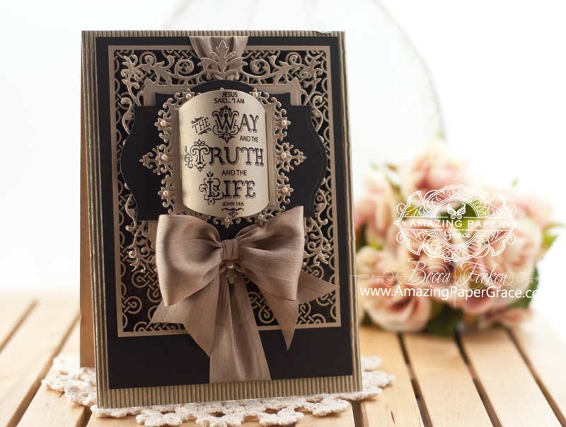
Both designs are elegant, both use the same stamps and die template but I’ll have to admit that one looks markedly masculine and one looks very dressy and feminine. Can’t you see the first card being used for Easter, a Christening or a Wedding? The second card would be suitable for a gentleman, a dignified show of sympathy or perhaps for your pastor. Really to tell the truth, wouldn’t either be appropriate for all of the occasions above, perhaps. So which colorway do you like best?
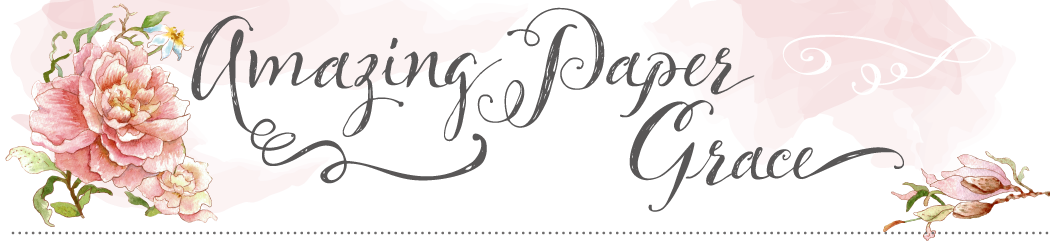
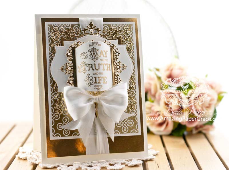
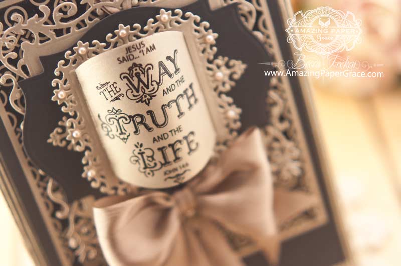
On top of my 5-1/2″ x 7-1/2″ card base I added a panel stamped with Celtic Knot Background. On the light card I stamped and embossed in gold on cream paper. On the dark card I stamped and embossed in black on gold paper. The next layer up is a new die, Spellbinders Floral Assortment which I topped that with Spellbinders Labels Eighteen. On the next layer I cut Spellbinders Classic Square SM and then centered and cut the small motif with at Spellbinders Floral Assortment from the same piece of cardstock to make a frame. I stamped my sentiment from Rejoice and Be Glad, on a panel cut with Spellbinders Classic Ovals LG. I know, it doesn’t look like an oval, but I make the oval arch and tuck it into the square frame I created and it gives the card some dimension. Here are some closer shots so you can see what I mean.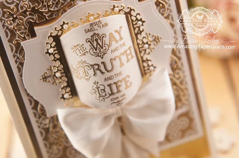

| CRAFT SUPPLIES I USED |
| Rubber Stamps: JustRite Papercraft – Celtic Knot Background, Rejoice and Be Glad Craft Paper: Light Version – Hobby Lobby Gold Metallic Poster Board, Neenah Classic Crest – Natural White 80 lb, Dark Version: K&Co Corrugated Paper, PTI – Black, The Paper Company – Ink: Light Version – Versamark and Dark Version – Gold Embossing Powder, Versamark and Black Embossing Powder Accessories: Spellbinders Floral Assortment, Spellbinders Labels Eighteen, Spellbinders Classic Square SM, Spellbinders Classic Ovals LG, The Paper Studio Pearls, May Arts Satin Ribbon |
The JustRite Designers had a chance to play with these delightful sets – be sure to stop by and see what they dreamed up.
By the way, JustRite Papercraft is having a couple of noteworthy sales this week :-)

Thanks for stopping by, I’ll be back tomorrow with a card for Mom :-)
Question Parking Lot


I personally think dark colour card is more masculine, but both cards are equally stunning!
How you manage to come up with something better and better every day is beyond me. These are absolutely stunning and I’m so glad you made two cards to compare colours. I love these cards a lot. Well, it’s time to go back and stare some more.
Impossible to choose a favourite as both are fabulous!
Hugs
Anne (UK) x
Oh my, I love the black, super stunning, elegant and lots of other adjectives to describe this card. AMAZING! Girl I wish you lived closer. Anyway you have a beautiful week.
Hugs
Mstgane
Ann
Your cards are just stunning!Your creativity is simply amazing.
Oh, WOW! They’re both fab, but I’m drawn more to the dark on as it seems to stand out even more.
Becca, it’s probably just a brain fog day for me, but if you get a chance to show how you made the frame to tuck the oval in, I’d appreciate it… I’m not quite following it in the instructions.
Positively gorgeous Becca! Art!
So beautiful and elegant! Thank you!
I really can’t make a decision as each card as its moment. What a beautiful set of cards. What catches the eye is the tucked in oval in the center. Very striking!
Geez, I love them both. Each one used for various occasions and recipient.
Becca, I just can’t choose, no way!! Both cards are stunning, gorgeous, amazing. Every single element on each is so carefully and thoughtfully placed…..Love both cards!!!
Thank you for sharing your talent and for inspiring us every day.
Absolutely gorgeous cards!!
I love both the cards. The darker one has a medieval feel to me which I love. Absolutely LOVE the way you tucked the sentiment to make it arch.
They are both just gorgeous however I do prefer the darker it seems much more elegant to me.
They are so elegant and beautiful! I especially love the colors. I’m always impressed with your talent. Thank you for sharing.
I love both of these! So beautiful and I love the verse! Awesomely done Becca!
Oh wow, how gorgeous are these? Love both, and I agree the darker colourway is an ideal male card. Hugs Christine
Gorgeous cards!
i love both colour ways as they are both so beautiful, as are the words to another believer. I would imagine any pastor receiving one of these cards would be very happy.
Which color do I like best? Are you kidding, Becca? I THOUGHT I’d ALWAYS LOVE GOLD the best, BUT this silver is WONDERFUL!!! It’s a slate looking silver, or pewter color. I LOVE BOTH!!!! :) I think they BOTH look “REGAL!” ;)
Happy blogaversary!! Wow – 7 years and I think I have been following you for most of those years. Your talent blows me away!! Your cards this posting are awesome, as usual. I wish I had your design talent!!!
Wow these are both beyond gorgeous, just understated elegance for both!!
WOW! So elegant! Both color palettes are awesome!
WOW! How do you come up with these ideas!! :) Both of these are stunning, love how you did the sentiment. I have to say the lighter color is my favorite.
Hi Becca,
Absolutely stunning and I love both of them. Congratulations on seven years of blogging!
God Bless,
Love , Myra xx
Hello Becca
I love the coffee and chocolate shades!
These are so beautiful …….I just love both of them !
Congratulations on 7 yrs blogging, so much inspiration…thank you!
Love Marg
Truthfully I don’t know which I like better. Both are beautiful for slightly different reasons. The dark colors are bold and the light colors are softer but I love them both.
Both cards are extremely elegant and so very different. Beautiful work Becca, as usual.
Congratulations for 7 extraordinary (for us) years of blogging. You seem to really enjoy it and I for one enjoy seeing your lovely creations. Thank you again for all you share with us both in your inspiring words and your ingenious designs.
I like both but the darker one just pips the white one for me. Love what you have done with that oval so clever.
Both cards are beautiful. The White one stands out more as a happy card and the dark one is definitely more somber. I really love the darker one.
These designs see just plain stunning, Becca! Elegant, classy, gorgeous!
Bonjour Becca,
Both cards are elegant and beautiful. No need to choose.
Hugs
Joan (Canada)
Oh my gosh Becca, this is sooo sooo beautiful. I just absolutely love the one in gold. It is so elegant and sooo sooo gorgeous. You´ve just done an outstanding job here once again sweet friend. Totally awesome lay out in this card here.
Gorgeous, gorgeous cards! I think the darker one is more elegant but I would be thrilled to receive either one. You are an amazing artist and I look forward to each and every post. Congratulations on your 7 years of blogging. I cannot tell you how wonderful it is to open my emails to find your posting.
Congratulations on your 7 year blogaversary. It was a great day for me when I found your blog. I enjoy it tremendously. I LOVE both cards, but am partial to the dark one. They are both simply beautiful!
I can’t decide as they are both gorgeous in their own way. I would chose one over the other based solely on the occasion. The gold one would be great for a wedding or anniversary. Would love to see you do this on a video. Thanks, Becca, for your creativity!
I Really needed this today and so Grateful
For these two cards. Thank you ever so much!
Can hardly wait to try these myself
You are soooo Talented. Thank God for your
Generous sharing with us
God Bless you
Joyce
Both are beautiful! You are so creative with the dies!
Wow- simply stunning!
I love this Scripture Verse! This card is amazingly beautiful!
Hi Becca. I love these – in both colourways! Beautiful new Spellbinders dies too. Hugs xxx
They are both so elegant and beautiful but I find myself drawn to the lighter version. Love these!
Both cards are beautiful, but I prefer the one with the black background as it makes the designs of the dies stand out more. I would be thrilled if someone sent me either one!
Love them both but would not send them to a man.
Stunning Becca, you do amaze me.
Rene from OZ xo
So very beautiful, Becca, & so very true!!! Thanks for sharing these masterpieces!!
These are stunning!!!! Of course I had to order the stamps (plus more backgrounds with 20% off) and the spellbinder dies. These cards are some of my favorites of yours!!! Blessings Becca,
Cindy
I Love the all Gold one. It is so elegant and feminine.
Congratulation on your 7 years blogaversary – I enjoy your postings so much. I have been following you all seven years and thank you for sharing your creativity with us. Both cards are very elegant but I prefer the lighter colored one. This is a wonderful sentiment also!
Amazing pieces of Art.
Hi becca I love your cards. Very beautiful and you inspire me a lot. Keep it up and god bless you.
AGAIN! You never cease to amaze me!!. How could you pick a card? They are both stunning. Please, please, please, How do you hold the oval panel?.
Happy 7 fast gone years!!
Oh goodness these are breathtaking & stunning!!! Wow you do such amazing work Becca!
Hugs,
Jo
xox
This is just fabulous, Becca. I like both color ways equally, as you suggested, for different occasions. What a wonderful card! Thank you as always for the inspiration!
I FORGOT TO ASK: What colors are the ribbons? Are they white and light brown?
Victoria
Hi Becca. Oh my goodness. I’m not sure I can pick one over the other though as both are beautiful : ) Take care.
Hi Becca, both cards are beautiful! You amaze me with your talent!! I like the second card color combo. I like the soft and vintage look of those colors together. Loves, Ruthie
These are stunning.
What a way to share the Gospel
2 stunning cards, so regal and elegant x
They’re both stunning Becca, it’s hard to choose between them but on first glance I was drawn more to the black on gold with the caramel bow as it has such beautiful contrast. You have so many clever ideas using these gorgeous dies, always thinking of ways to make them do more. Thanks for sharing your ideas and for inspiring others to create something so special.
Oh Becca, once again you have shown us awesome cards, I honestly love them both, maybe the darker one a little more but they are just lovely.
God has given you such a gift and we are so blessed that you have such a generous spirit in sharing your gift with us. My day is made each morning when I see another of your cards. Bless you.
Beth NZ
Hi Becca! I really like BOTH of your cards!! I just can’t decide with one I like the best so they are both winners in my eyes. Heartfelt hugs!
Hi Becca! Both cards are just gorgeous! Good to have a feminine and a masculine version!
Two very beautiful cards Becca if I had to make an impossible choice it would have to be the darkest card – love all your added touches x x x
These cards are truly amazing. You are a great source of inspiration. Thank you!
Kim
I really like both ways…but that dark one really stands out…both so amazing!
Becca another amazing card. Just love the ideas you come up with. Happy 7th Anniversary.
Hugs Trish
These two creations are just beautiful.
This is so beautiful! Today I did silly. Tomorrow I want to do beautiful! Just like you! TFS!
Beautiful cards! Had to give up one of my older stash of cards today! Lucky for mr, the person receiving it loves to get a home-made card……
Dramatic in black! This is an awesome card in either color. Nice design Becca.
I kinda think I like the darker one more- but I also love the lighter one. Your work with dies is amazing!
Becca, both of your cards are gorgeous. And yes, I can see either of these for any number of occasions. Great work!
They’re like milk & chocolate cakes! Cool&delicious!
I love this verse. I love it in this format of fonts. I love this card in both colors. I have to check out this stamp. I want to learn these large satin ribbon ties.
Just so pretty…Thank You for all your hard work…and sharing with all of us…
These cards are breathtakingly gorgeous!!
This is beautiful and I love the 3D treament you gave the sentiment panel.
Hi Becca. Both your cards are so beautiful, thanks for sharing.
Both cards are beautiful, I don’t really have a favorite each has it’s own beauty.
Lynne x
Good morning Becca,
How are you enjoying the start of your 8th year blogging and showing off your magnificent works of art. I know i only found you relatively recently but oh boy was i a gluten for looking back at what you already had put up for our delight. You don’t give yourself the credit you are due for your original forray into blog world that you truely deserve. THANK YOU for all the beauty that you have brought our way as you truely give such inspiration out to us with each and every one.
Today’s cards when i first seen them i did think of happy occasions in our lives for the cream and gold and the worst occasion for the 2nd card but both are stunning and i can see why you would say about the 2nd card being suitable for those pesky men in our lives that don’t like sparkle or the soft feminine look. When i read the phrase on the top it immediately makes me think of a truly devout couple getting married by the minister/ priest/ rabbi/ pastor etc as this was part of my wedding ceremony when i got married and also part of my children’s baptism christening ceremony so it is just right for all these occasions. Have a lovely day,
Love and crafty hugs
Norah (Glenochil)
Becca these are stunning, like you say one very masculine the other quite feminine, cannot choose as they are both exquisite.
Love & hugs
Jacquie J xxx
Wow both are great but I really like the darker one the best. Very striking, and I love the sentiment it is great and so True! Can not wait to see what everyone else did on their cards. Thanks
Hi Becca the cards are both beautiful I could not choose
Oh my they are both just Wonderful!!
Hi Becca, both these cards are stunning, oh, how I wish I could ever just make one bow as perfect as you do! Both the colour ways are beautiful and as you say could be used for so many different occasions. Craft huge to all. Linda
Becca, you are so creative; how do you come up with these great ideas? Your cards are always sooooo beautiful. We’ll done.
Very pretty
Beautiful design. With the thought of picking the color combination I would like best, I immediately thought of two tones of one color – especially the light and darker seafoam/aqua shades. But of the two choices here, I prefer the lighter one.
Equally amazing!!
Hi Becca, Stunning !! I’m loving both colourways, and the sentiment is beautiful especially for the coming religious occasion.
Lots of love from Patricia xx
Thank you, Becca, for providing us with these contrasting samples so we can get a sense of what role color plays in the “feel” of the card. Both are beautiful. I really appreciate you sharing how you achieved the dimensional look on the sentiment panel. Reminiscent of an open page of a book – very effective.
Seeing your beautiful work and reading your posts is like receiving a sweet treat for the day!
Blessings!
Love you Becca.love your work
Both cards are gorgeous. Each colorway has its own merit.